What is a Brand Style Guide?
Before creating a Brand Style Guide, your designer needs to have created a set of visual brand elements. Then those design elements should be brought together into a set of visual standards within a brand style guide.
Discover more here on: ‘How to create a powerful brand identity’
No matter what size your business is, a brand style guide is essentially the glue that holds together your visual brand identity. Whether you’re a small business, a large organization, or just starting, a brand style guide is an invaluable asset that helps build trust in your brand.
Think of your brand style guide as your business’s primary visual DNA – A practical document that contains specific, detailed rules about logo usage, typeface systems, color palettes, layout guidelines, and so much more.
The purpose of a brand style guide is to establish and enforce a set of design element styles – so that all of your design collateral and marketing material will have a cohesive look that matches the voice of your brand.
A brand style guide will save you time and energy
Without a brand style guide, every interaction you have with the professionals creating marketing graphics for your brand will come with headaches. You will have to explain your brand vision and the look you want to achieve every single time.
Whether it’s a printer delivering business cards, a web designer creating a new sales page, a book designer doing your ebook, or a social marketer setting up an ad campaign and creating social media posts – if you don’t have a brand style guide, your presentation will vary and you’ll find that you keep saying “that’s not how I want it to look”.
Having a brand style guide will save you wasting time and energy, so you can focus on growing your business and brand.
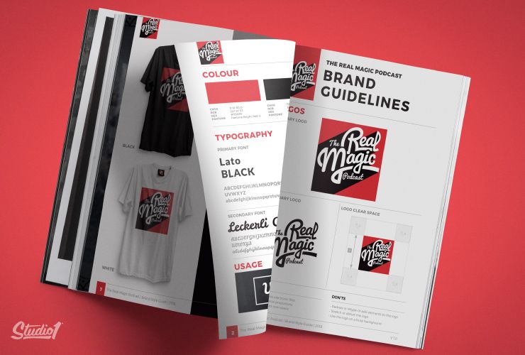
Why every brand should have a style guide
Having a brand style guide allows you to have a congruent look and feel for all of your marketing so that you look more professional and more trustworthy.
The brand style guide helps all the creatives who work on your brand including; website designers, social media designers, stationery designers, videographers, signage designers, etc.
They can all follow the same set of guidelines to make sure your assets are used professionally. That way you will have a consistent look across all of your marketing. Your suppliers will easily stay on target and deliver a unified look for your brand.
Without a style guide, you risk inconsistency across your marketing. If you’re not consistent, your brand will end up appearing unprofessional and you will appear making your brand less trustworthy. It’s a crucial control mechanism for your brand.
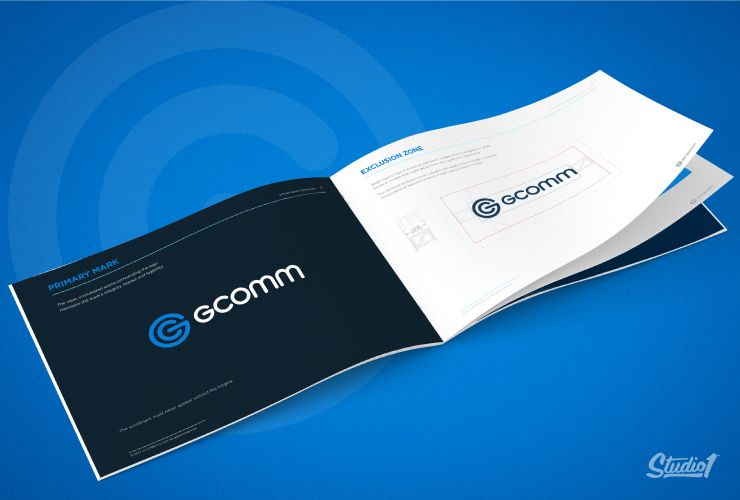
What should a brand style guide include?
A brand style guide is like a great recipe and has many ingredients and instructions. Some of these key ingredients include:
Verbal Summary:
Be sure to include a verbal summary of your brand at the beginning of your brand style guide. This can include your brand’s mission, core values, your brand personality, your brand vision, your brand’s target audience, and your brand’s story.
This is extremely helpful for creatives to read before they design for your brand so they truly understand what your brand is all about.
Logo:
Your logo is your brand defining symbol and is one of the key elements in your brand style guide, so be sure to include images and specifications of:
- Primary Full-Color Logo
- Logo Color Options – full color, monotone, limited colors, etc.
- Positive and Negative versions of the logo
- Secondary Logo(s) or Monograms
Logo Rules:
Establishing a detailed set of rules for your logo usage is important for brand consistency. Especially as your logo will be represented in a wide range of branding touch-points.
Logo rules to consider:
- Sizing – establish a minimum size for your logo’s text to be legible.
- Size concerning other assets, like taglines.
- Clear space – how to handle the space surrounding the logo to avoid interference.
Logo DO NOT’s – Logo treatments to avoid
Show examples of how the:
- Logo can’t be bent, twisted, or inclined
- Logo can’t be embossed or beveled or created in 3D
- Logo can’t be displayed on various backgrounds
- Logo can’t be colored in various colors
- Logo can’t have drop shadows or shading within
- etc.
Color:
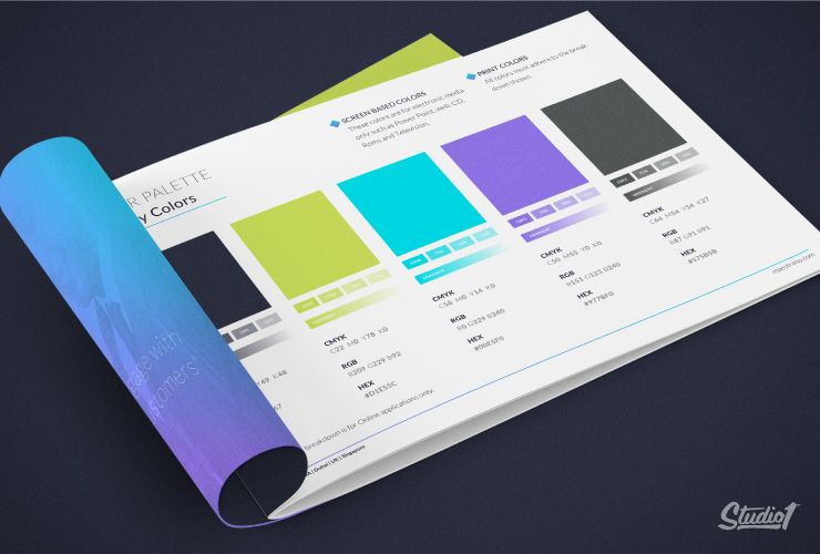
Your brand’s color palette is generally made up of primary and secondary colors.
Your primary colors may be derived from your logo or they may stand alone. This palette may also include a ‘Call To Action’ button contrast color.
Your secondary colors are usually complementary to your primary palette and may be made up of subtle variations to your primary palette. This allows for more scope and flexibility in the design process.
Colors require different values and settings on various printing processes and devices. Always include print and screen/web color equivalents.
For print, including CMYK and Pantone references, while screen/web colors are often defined in RGB and HEX codes.
Typography:
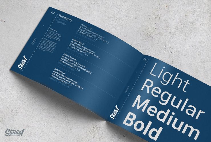
Typography refers to the font (or typeface) you choose for your brand identity. Your brand style guide needs to exactly spell out which font families to use for your brand and in what situations and for what specific purposes.
Most brands use 1-2 primary fonts and 1-2 complimentary secondary fonts.
- Primary fonts should be chosen for their flexibility so they can be manipulated in different ways (e.g. uppercase/lowercase, bold, italics) and they should be web-friendly. We recommend using Google Web Fonts so they can be viewed correctly across most modern devices. These fonts are generally clean and legible serif or sans-serif fonts.
- Secondary fonts can be more creative like script or display fonts and are great for adding brand personality and style to your brand.
It is also useful in the brand style guide to visually show how the various styles can be applied for items like titles/headers, subtitles/subheads, paragraph titles, emphasized text, captions, and body copy.
Pattern & Texture:
This section will include: Background, branded patterns, icon pattern repeats, textured pattern repeats, etc.
Imagery & Photography:
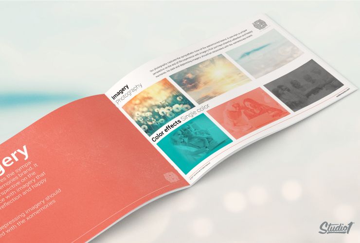
Your images are one of the most powerful sets in your brand style guide as they create a mood, evoke an emotional response, tell your story and showcase your products or services.
Here, you’ll need images in many aspects of your brand, from your website and social media activities to (potentially) your logo and content-marketing initiatives. This part of the guide aims to educate anyone who works on your brand’s marketing on what sorts of photography is appropriate for your brand and what compliments it. It’s also good to show examples of the type of images you don’t like.
This section will include photography styles, lighting, composition, color hues, etc.
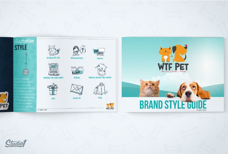
Illustration:
This section will include Icons that support your products, your programs, your USP, your explainers, your instructions, etc.

Website elements:
Websites often have multiple pages so it’s worthwhile to define how certain elements on the web pages should be styled so that developers can keep these elements consistent across all pages. This includes:
– ‘Call to Actions’ Button Styles
– Opt-in Forms Elements
– Layouts & Compositions
– Iconography
Style guides are not set in stone. They are living, evolving sets of guides that creatives should use as a baseline when designing for your brand to ensure you get a cohesive visual voice for your brand.
To discover more about the importance of branding branding in a competitive world, we have put together this series:
A Mood Board is where the true magic happens
How to Create a Powerful Brand Identity
If you’re ready to take your brand to the next level, get started below…


