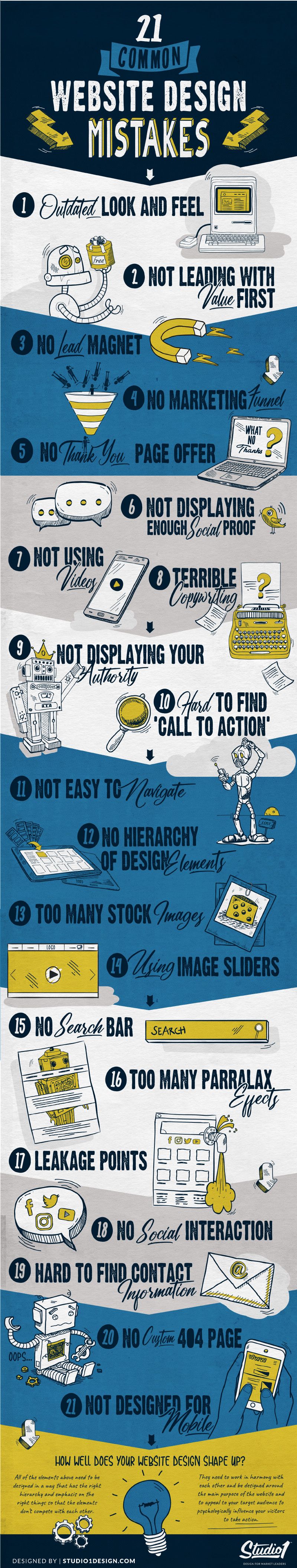
Mistake #1: Outdated look and feel
Your website needs to appeal to a targeted audience. If it hasn’t been updated for a few years and it looks dated, your prospects may not think that you are still relevant.
Even worse they may think that your business is only as good as the way your website looks. So don’t let your website design be the reason that your visitors don’t trust you or take you seriously.
Mistake #2: Not leading with value first
97% of your visitors aren’t ready to buy, so don’t sell on “Hello”!! It is unlikely that people will buy from you if they have only just discovered your website.
So instead of trying to make a sale straight away, lead with value first. This could be in the form of a lead magnet, helpful information, or content that leads with providing value.
Mistake #3: No Lead Magnet
70% of your website visitors will never return! So you need to give them a reason to engage with your website.
All they care about is ‘what’s in it for them so give them a reason to get to know, like & trust you.
Educate your cold prospects first to help them on their journey, with things like a: Checklist, Quiz, Downloadable Guide, Video Series, Challenge, Free Trial, VIP Club Benefits, etc.
The free content can also be in the form of blog posts, free podcasts, free videos, and have a goal of capturing an email address.
Mistake #4: No Marketing funnel
Having a lead magnet is only the start. To warm up cold prospects that aren’t ready to buy yet, you need to have a marketing funnel that’s designed to build trust over time.
Businesses that have a marketing funnel are twice as likely to see a significant boost in sales.
Your marketing funnel could be very simple and have only two steps to a sale, or it may have many steps delivered by email over time. It all depends on your offer, your price point, and your target audience.
Mistake #5: No ‘thank you’ page offer
After somebody opts into your free lead magnet, most businesses send them to a simple page that says ‘thank you for downloading our free eBook’. That approach is a terrible idea and potentially a missed opportunity.
Your prospects have just said YES to your free offer and they may want more, so allow them to have more from you.
On your ‘thank you’ page have another offer. It could be a: webinar, a survey, a free strategy session, a limited-time offer, or something to get them further down your marketing funnel.
They may not be ready or have time to take you up on the next offer so be sure to email them the same offer.
Mistake #6: Not displaying enough social proof
Social proof is one of the most powerful psychological to influence people to take action on your website. People are skeptical of claims made on websites, and they turn to others to check if the claims are true.
They want proof from other people they identify with that are in a similar situation as them. So having social proof testimonials or case studies from existing customers will provide proof that your product or service gets great results.
There are many ways to display social proof on your website, including…
- Written Testimonials
- Video Testimonials
- Story-Based Case Studies
- Referred Authority (Photos of you alongside an authority figure)
- Customer Reviews
- Customer Logos
- Numbers – If you have high numbers of customers you have helped, social media followers, years in business, current members, downloads, etc, then display them in large numbers on your website.
Mistake #7: Not displaying your authority
People trust credible, experts so you need to display your authority on your website to prove that you are an expert in your niche.
This can be displayed with headlines, taglines, and images of you speaking from the stage, or working on the tools, onsite with your team.
Display your credentials like Dr., Author, Speaker, etc. have: ‘As seen in’ or ‘As heard on’ logos, display your metrics to prove your authority, use ‘borrowed authority’ by having you seen with other authorities, etc.
Releasing your knowledge in the form of blog posts, podcasts, videos, infographics, etc. is also a great way of displaying your authority.
Mistake #8: Not using videos
Youtube is the world’s second-largest search platform, behind Google. People like to watch videos to be entertained, inspired, relaxed, and to escape or to feel connected with people, so it makes sense to utilize videos on your website.
Videos are a powerful way to build trust, especially with you have a face-to-camera video of you talking about how you understand your prospect’s situation and have a solution to their problem.
A lot of people are not comfortable being recorded on video to be displayed publicly, however, it’s a great way for people to get to know you. Some people may not like you (that’s fine) and some will love you enough to reach out to you and even purchase from you.
You can also use video to tell your client’s stories. Put their testimonials and case studies on video and they are much more believable than written testimonials because they are undeniably real.
Mistake #9: Terrible Copywriting
Your customer is the hero, not you. Your business is the guide so your copywriting needs to reflect that.
One of the biggest mistakes I see small business owners make when writing their copy is they write all about themselves & their business.
All your cold visitors care about initially is ‘WHAT’S IN IT FOR THEM’. They want to know if you have a solution to their problem.
Since it only takes 5 seconds for your visitors to decide if your website is for them or not, the words on your website are crucially important.
The goal with your copywriting is to hook your visitors emotionally, then your offer and how they will benefit, and back up your claims and have some proof from your past customers to show that your solution works.
Copywriting can significantly make or break a site so I highly recommend hiring a copywriter that understands direct response marketing.
Mistake #10: No easy-to-find ‘call to action’
You don’t want to confuse your prospects, so having a clear ‘Call To Action’ (CTA) gives a clear instruction of what you want your visitors to do next on your website. Ideally, the CTA will bring them one step closer to conversion and will ultimately take them through your sales process.
Make sure the button color is contrast enough to draw people’s attention to it. Adding clear space around it can help draw more attention to it. Then keep one consistent button color on every page, so your visitors get used to knowing what to click on next.
If you have a long sales page with multiple sections, you can duplicate the CTA throughout the page, plus you can place it in the sticky top nav, so it’s always in view while scrolling through the page.
Put a CTA on every page to make it easy for your prospects to find your offers. Use wording on your CTA buttons that describe what’s going to happen when they press the button. So instead of writing SUBMIT on an inquiry form, write SEND ENQUIRY.
Mistake #11: Not easy to navigate
Make it easy for your visitors to find what they are looking for. If your website is using navigation that is too different from what the majority of people are used to you risk them becoming frustrated and leaving your site.
Don’t try to be too creative when it comes to the navigation on your website. Keep it traditional by having it across the top of your website.
If you offer multiple categories, add left-hand side navigation to help filter your products easily. Most successful eCommerce websites that offer a lot of products, use a left navbar.
Always think of your prospects when designing your navigation. Try not to give them too many options in the top navigation. Only have what’s required to support the sale, then put everything else in your footer navigation.
Mistake #12: No hierarchy of design elements
From the top of your website pages to the bottom, each section needs to be easy to understand and should capture the attention of your visitors enough to entice them to take the next micro-step. (To scroll, to click a button, to watch a video, etc.)
Each page on your website needs the ‘above the fold’ section to have clarity so your visitors can quickly work out if your website has something for them or not.
You can achieve this by removing any clutter and having the remaining elements thoughtfully placed on the page in a way that enhances your message and gives clarity to your offer. Less is more, especially when it comes to great user experience and design.
If your page is cluttered with too much stuff it will be overwhelming for your visitors, which will frustrate them and leave your site, so remember that you only need them to make a micro commitment initially, so focus on clarity.
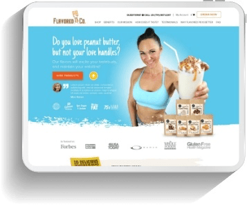
Mistake #13: Too many stock images
A lot of businesses use cheesy stock photography which makes their website look tacky and cliche.
Instead, use images that are unique to your business, or hire a photographer to take photos of you and things related to your business.
Beautifully taken pictures of your business will help you establish a brand that will become a household name. The goal is for your site to be unique and memorable so that you stand out from your competitors and don’t look like everybody else.
If you do use stock images, at least have them customized to be more on-brand and unique to your business.
Mistake #14: Using image sliders
Moving images on sliders may seem like a fancy and exciting way of grabbing attention but in reality, they are likely to decrease conversions, and here’s why…
- The eye reacts to the movement (and will miss the important stuff, the words on each banner.)
- They decrease readability.
- There are too many choices within them.
- They are distracting, especially when trying to read something else on the page.
- You are taking away control from your visitors.
- They imitate advertisements, which leads to “ad blindness”.
- Your visitors may be reading the words on the first image, so they get annoyed when it changes to the next image.
- Sliders take much longer to load than a single image, so that will annoy your visitors and increase your bounce rate.
- Due to sliders taking longer to load, this will push your organic search results lower. Google favors a fast-loading website.
Sliders are a lazy way of displaying content. Instead, try displaying your highest-converting products, and try adding value to the offer with a bonus.
Mistake #15: Too many parallax effects
For similar reasons to ‘Image Sliders’ (see above), parallax effects may look good to some, however, they are distracting and can hurt your conversions if overused. So keep the moving effects to a minimum or don’t use them at all.
The more parallax effects on your website the slower it will be. Mobile devices often have a hard time reading parallax effects correctly and some effects can’t be viewed on a mobile device.
Mistake #16: No search bar
The job of your search bar is to help your visitors get to your website’s products or content quickly. Without a search function, your visitors may be searching for a piece of content but can’t find it quickly so you risk them getting frustrated and leaving your website.
You may not think that having a search function would make that much of a difference to sales on your website, however having a search bar/search function in the header of your website near the top navigation saves a lot of time for your visitors.
Making your on-site search a painless process can reduce the stress of your visitors which can lead to increased sales.
When you do have a search bar, your website will be able to record every search query, which is excellent data for you to study so that you can create future content around the most popular search queries.
Mistake #17: Leakage points
When you drive traffic to your website it needs to be designed in a way to keep people on your website so that they don’t leak off your site unnecessarily!
The purpose of social media is to drive traffic to your website since that’s the hub of your business and is where you have offered. So don’t have social media buttons on your website, especially above the fold. All you are doing is advertising the social platforms by displaying their logos. Even worse if your visitors click on them, they will leak off to social media and most likely will get side-tracked and never come back to your website!
If you’ve invested in sending PAID traffic to your landing pages, don’t have any leakage points on those pages. So don’t put social media links on there and don’t use YouTube videos unless you have a paid account and you can prevent ‘other people’s videos’ from showing at the end of your video and don’t have the YouTube logo in the bottom corner of the video isn’t clickable or you will lose your visitors.
Pages such as Terms and Conditions, Privacy Policy, Contact, and any other necessary content should all be designed as pop-ups on the same page. This prevents visitors from leaking off to another page, and never coming back. Those other necessary pages should also be housed on your main website so that they can be accessed from your footer.
On your checkout pages, remove all navigation and only give them one CTA – to purchase!
If you have blog posts or other content where you do need to have external links, make sure the links open in a new tab so that your web page remains open on your visitor’s web browser.
Mistake #18: No social interaction
If you are using social media to promote and broadcast your content, then allow your website visitors to comment on your content on a web page. The more comments, the more social proof that it’s popular.
Every website should have a feature that allows your visitors to share your content with their preferred social media platform. Many free plugins do that.
The more comments and shares your web page has, the higher Google will rank it in a relevant search term.
Mistake #19: Not easy to find contact info
It amazes me how many websites make it hard for their visitors to contact them. Some don’t even have a contact page or contact phone number.
We encourage you to put a phone number on your website on the relevant pages that will support a sale. It’s especially effective to put it near a BUY NOW button. It gives people peace of mind that if they do purchase from you and something goes wrong during the checkout process, they can contact you quickly.
Don’t put your email address on your website or you will find that it attracts spam bots and you will receive a lot of junk email. Instead, have an easy-to-find contact form.
I also encourage you to use live chat on your website so that you can answer any queries and customer objections. It’s a great tool to start a conversation with your prospects.
You can also use tools like SpeakPipe that allow your visitors to record their voice and have the audio emailed to you.
Mistake #20: No custom 404 page
Most 404 pages simply have a message saying that the page you are looking for doesn’t exist. That’s not very helpful. It’s quite common for people to land on a 404 page, so it needs to be designed in a way that gets people back on the right path.
So put a search box on the 404 pages, along with junction boxes that have links to your products or services, have links to your lead magnets, content categories, and contact page, etc.
It should be designed in a way that is a gateway to your important pages to help people get back on track quickly.
It’s also a good page to have a bit of brand personality. When people land on the 404 pages, they will likely be frustrated so try to lighten the mood by being a little cheeky with the design and potentially inject a bit of comedy with a funny or clever image.
Mistake #21: Not designed for mobile
Now that Google has announced that they rank websites based on the mobile version of your website over your desktop version, the goal is to make your website load fast on a mobile device.
Remove any unnecessary design elements such as parallax effects, large images, etc if they don’t contribute to making a sale. Replace background images with
Replace categories with accordions to compress them to a single expandable category button instead.
Place your CTA’s in the sticky top nav or sticky footer nav, so it’s always in view while scrolling through the page.
Summary…
If you are making a lot of the mistakes above, then the good news is that when fixed, you will increase your conversions.
At Studio1Design.com we have designed literally over 25000 web pages for our clients. They are all designed to be 24/7 marketing machines.
If you have any questions specifically about your website, then we’re happy to answer them – in person. Schedule a 15-minute call here to discuss your website goals and challenges. We will help you identify what’s holding your website back. No pressure, no obligation. Just a friendly chat to see if we can help you =)