Google keeps changing its ranking algorithm, taking into consideration these Core Web Vitals.
A fast loading website on mobile is important for rankings since more website traffic globally is now viewing websites on mobile devices instead of on desktops.
We understand the importance of speed on mobile for SEO ranking however, we also know that speed isn’t everything for rankings, so you need to balance speed with conversions, which is all about building your E-A-T by proving that you’re an Expert and raising your Authority & Trustworthiness.
Google has a new Site Speed Comparison tool called Sandbox that displays the site speed value based on search terms.
I made this quick video using the Sandbox tool to show you that site speed isn’t everything when it comes to ranking a web page…
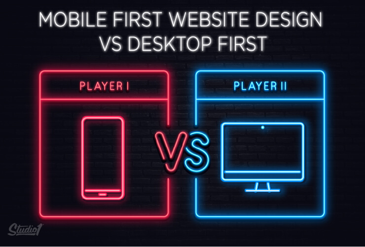
Should you start with a mobile-first design?
Because Google ranks websites based on the mobile view, it seems logical to think that you should design the mobile view of a website first.
However, we believe that designing the mobile version first could harm your overall website results, and here’s why…
While a website’s desktop design and mobile design need to be coherent, that doesn’t mean they’re one and the same. In fact, they need to have two different design approaches in order to achieve conversions on both versions.
When people are out and about using their mobile phones, their internet speed may be slow. They are usually filling in time while waiting for something else, so your website needs to give them the experience to reflect their situation by having it load fast, with abbreviated and concise content with a simplified user experience.
Desktop users usually have more time and faster internet. They also often have a goal they’re trying to solve a problem, and your website could be their destination so it needs to be designed to impress your visitors by having a memorable brand personality, plus it should have all the psychological drivers, designed with the right visual hierarchy to persuade entice to take action.
Designing for mobile first before the desktop version makes it more difficult in the long run. It’s harder to expand on a simple design and content (mobile-to-desktop) than it is to simplify a desktop design (desktop-to-mobile).
Designing for mobile first usually results in the desktop version looking very plain and lacks the psychological drivers and brand personality.
When you’re designing for a smaller canvas (mobile), it’s difficult to include brand elements, trust elements & proof elements, including images, photos, and videos, because it all adds to the load time. Then, if the desktop version is designed to match the mobile version, it usually looks quite bland and is missing all the conversion elements and brand personality.
So, what is the best way to design a website to get the best results and look great on both mobile and desktop?
Our answer is…
Design for desktop first, while thinking about mobile at the same time!
We always design the desktop view first, so that we can add brand personality and include all the conversion assets and psychological drivers that position you as the trusted go-to authority, but we always have the mobile view in mind while we’re designing the desktop version.
When we design the mobile version, we need to balance conversions with speed and design it in a way that caters to their intent and limited attention span. So we need to be clever with the UX on mobile.
Not all industries are equal online. Check your Google Analytics and you may be surprised to find that you still get more traffic on desktop. I know we do, and so do the majority of our clients that offer services, or education.
So it makes a lot of sense to invest in your website’s desktop design!
Websites with a bad user experience on desktop or mobile can prevent a visitor from turning into a hot lead or a sale. So we need to optimize the mobile and desktop in different ways.
For desktop, here’s how we design a website to give you the best chance of boosting your results:
- We need to make sure you lead with value, have helpful content and we must showcase your authority.
- We need to make sure the copywriting is persuasive & hooks people emotionally, explains clearly how you solve your prospect’s problems, and what the implications are if they don’t choose you.
- We need to display the benefits of your offer and we need to position your customers as the hero and your brand as their guide. Our conversion-focused design enhances the copywriting plus we use social proof and credibility boosting elements throughout the site using psychological persuasive drivers that help build trust.
- We use a color palette and images to appeal to your target market, with a modern design layout that is clear & easy to navigate.
- We make sure the design has the right visual hierarchy to entice your visitors to take action. (Opt-in &/or buy, get started, etc.)
How to optimize your website for mobile:
Reduce content & remove sections
Given the shorter attention span of mobile phone users, it’s essential to have the mobile site load within 1-3 seconds, or you will lose your visitors.
The goal is to have it load fast AND convert, so it can be a balancing act of what to simplify or remove. So if we think it won’t reduce conversions we will:
- Replace background images with a flat color, if it still looks good.
- Recode images at the smaller dimensions that appear on the mobile view.
- Reduce the amount of vertical height of some elements & sections to save scrolling.
- Remove some elements & sections altogether, if we think it won’t reduce conversions.
- Replace image slider testimonials with static testimonials.
Images on Mobile
One key to speeding up your website is to make sure images aren’t unnecessarily large. Don’t upload a 1000 x 1000 pixel logo if the logo is only 200 x 200 pixels on the site. Some image formats such as SVG will reduce the file size and improve speed, compared to a PNG or a JPG file. Developers should recode smaller images for mobile responsive views.
Tip: Reduce the file size of all images using a tool like https://kraken.io
Videos on Mobile
Videos can slow down the speed of the desktop version of your website, and they are even slower to load on the mobile version of your website. So a pro tip is to display an image of the video on the page, then when pressed, have it load the video. That way, when the page loads it isn’t slowed down because it doesn’t have to load the video.
Call to Actions (CTA) to boost conversions on mobile:
• Sticky CTAs: A sticky CTA should be positioned at the top or at the bottom of the web page. And it should not move when scrolling up or down the web page. This means the button is always in view & accessible, regardless of where the visitor has scrolled to the page.
• Contrast CTAs: Your CTA button needs to stand out and attract attention. To achieve that, the button should be in a color that contrasts with the color surrounding it. Avoid ghost buttons.
• Click to call: One of the most effective calls-to-action you can use is ‘click to call,’ which lets customers dial the business with one click.
• ‘Text Us’: is an amazing underused CTA on mobile.
• Pre-populated fields: Display example text on the form fields of your forms (e.g. Name: John Doe) so that customers are guided as to what they should write.
Avoid dark backgrounds on mobile
White text on a dark background is difficult to read outdoors. Instead use dark text on a light background, as much as possible.
eCommerce tips for mobile:
• Keep the search box in the sticky top nav-bar
• Use accordion menus for categories.
• Keep the CTA above the fold. Move part of the product description under the CTA so it doesn’t push the CTA below the fold.
• Use arrows instead of thumbnails to show the other product images.
• Checkout page needs the CTA at the top of the page (Preferably in the sticky header).
Your Action Steps:
- Test the speed of your website using Google’s Page Speed Insights Tool
- Implement our tips above
- Use the same tool again to test the speed. The goal is to get into the green or as close as possible. Don’t remove too many sections or elements though if it reduces conversions. It’s a balancing act to get the speed fast while still maintaining conversions.
I’m no Steve Jobs however, I hope that I’ve helped you ‘Think Different’ about your website design and don’t follow the masses by designing the mobile-first or discard the desktop view altogether!
Leave a comment below or contact us to see how we can help you with a new website that performs well on desktop and mobile =)

