As a business owner, there is nothing worse than pouring weeks into creating your website or sales page, only to have it not convert.
You have a good offer and you have sent targeted traffic to your page so you are left scratching your head as to why it’s not converting as well as you hoped it would.
So you study your analytics, heat maps, and watch videos of your web page visitors, and you notice that people are scrolling straight past your ‘Call To Action’ (CTA) button.
That’s the story I often hear, and when I review their page I can see various issues, however for this article, we’re going to focus specifically on issues with the CTA button.
So let’s explore why people aren’t pressing the button, and how to create a compelling call to action that entices people to take action and essentially boost your conversions.
The answer lies partly in the definition of a CTA. According to Google, here is the definition…
“Call-to-action (CTA) buttons are the buttons you use in your website and on your landing pages to guide users towards your goal conversion. It’s the part of the landing page that the user needs to click in order to take the action you want them to take.”
In other words, it’s an action you want them to take, therefore your entire web page should be designed with that action as the goal of the page.
A strategic design will make it impossible for your visitor NOT to pay attention to your call to action. It requires:
- Placing the CTA in the right context
- Take Your Visitors to the Next Stage that’s Right For Them
- Well-written copy on the actual button
- Attention-grabbing visual design
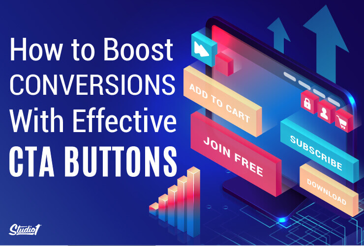
So let’s explore how you can include all of those 4 points when crafting an effective Call to Action on your website. These 4 tips will help you capture customers’ attention, compel them to take that next step in your sales funnel, and boost website conversions.
1. Place CTAs in the Right Context

A common mistake that business owners make when crafting their CTA buttons is…
They think that it’s a standalone button that doesn’t have to be directly related to the thoughts that are going on in the minds of your visitors.
Context is everything!
If your CTA is asking for them to take action before they are ready, then they won’t convert. So you have to think strategically about when to show the CTA.
That’s a key reason NOT to have a pop-up asking people to give you their email address the moment they have landed on your web page. They aren’t ready for that yet. All they want to do is browse your page, to see if it has what they are looking for.
Plus you will ruin your brand’s integrity if you annoy people with random pop-ups if they aren’t ready for it. Instead, consider having a pop-up that is only triggered by your visitor leaving your website. Or consider no pop-up at all.
The CTA needs to appear at the right time on your web page, and it’s not always at the top of the page.
The best position to have a CTA button is after you have earned their trust and given them a strong reason to take action. That can require a lot of persuasive copy, social proof, and reasons to choose your solution to their problem. So depending on your offer, the CTA could convert better if it isn’t at the top of the page.
You must deliver the right message to the right audience, and add the CTA at the right time.
CTA buttons placed high on the page usually convert better on free offers, than a CTA further down the page, so for free offers we use a bit of a ninja trick…
Let’s say you’re driving traffic to a free offer in return for an email address. You have a compelling headline and benefit-driven bullets, and a CTA button. Instead of asking for their first name and email at the top of the page, we just have the button.
When the button is pressed, the page scrolls at a medium pace to the bottom of the page, and that’s where we ask them to enter their first name and email. That way they can see that they have just scrolled over something else, but they aren’t sure what it is. So they often scroll back up to see what they have missed (FOMO), and they get to see all of the other information on the page that will boost conversions, like benefits of the offer and social proof, etc.
If the CTA doesn’t fit with the context of the headline, body, and design of your web page, and is out of context, your customers won’t see the full value of your offer, and likely won’t pursue the next steps of the customer journey.
How do you do that? Let’s explore the second point…
2. Take Your Visitors to the Next Stage that’s Right For Them
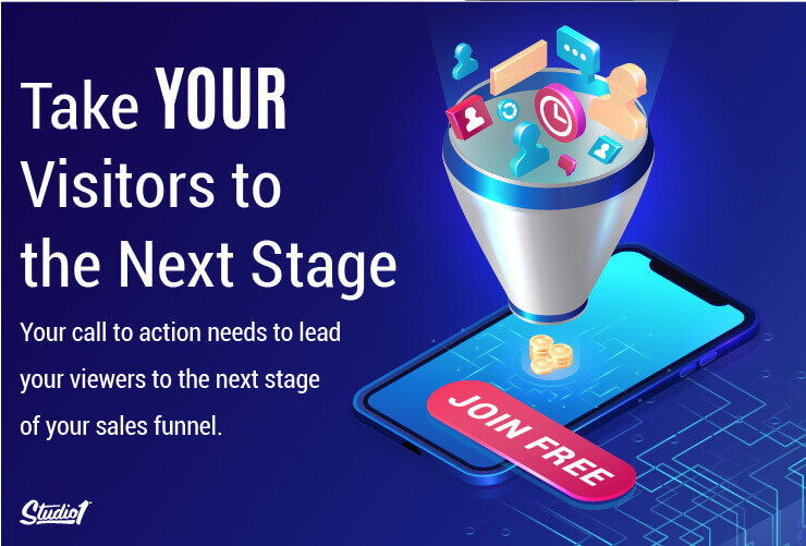
The purpose of your CTA button is to change a passive website viewer into an action taker. And to do this, your call to action needs to lead your visitors to the next stage of your sales funnel.
The best way to do this is to have specific CTAs that talk to the situation they are in.
Specificity lets you tailor your CTA buttons to reflect different points in the customer journey, and even customize them for different audience segments.
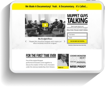
This is exactly what we did when we designed the new TheOnlineDogTrainer.com website.
You will see they have a GET STARTED CTA in the hero section on their home page. When pressed it scrolls down to the next section that has 5 CTA buttons that talk to the situation and pain-points of their audience.
- I need my dog to be LESS AGGRESSIVE
- I need my dog to COME WHEN CALLED
- I need my dog to STOP LEASH-PULLING
- I need my dog to STOP BARKING
- I need help TRAINING MY NEW PUPPY
For a start, the audience gets a sense that the website knows them and wants to help them. That builds trust in your brand.
As the website owner, you are able to track important data on understanding the audience by gathering insights based on which CTA button they clicked on.
Another way to approach this I to have a quiz to help segment people.
A great example of this is on our new website design for EvanMarcKatz.com Evan has created free and paid solutions to suit their pain points and where his audience is at on their journey, based on their answers to his quiz.
The point here is that on your home page, it’s best to give people options. There is never a one-size-fits-all CTA to suit all segments of your target audience. 97% of your website visitors are not ready to buy, so it’s best to give them a choice of actions that meets their needs.
It could be to schedule a free call however, that could be a big commitment to somebody that has never met you, so introduce another free offer like a helpful PDF that they can download. Then you can build trust with them over time until they are ready.
Now let’s explore what wording works best on the actual button…
3. Create a Benefit-Driven CTA
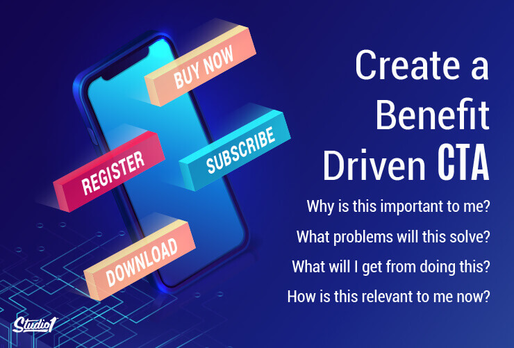
By nature, your website visitors are only interested in things that will benefit them…
They’ll subconsciously ask themselves:
- Why is this important to me?
- What problems will this solve?
- What will I get from doing this?
- How is this relevant to me now?
Your CTA buttons should speak to these personal concerns. A benefit-driven call to action entices your customers to click because it tells them they’ll personally benefit from doing so.
In contrast, a feature-driven CTA just tells them what kind of product they’ll end up with – not how it will improve their life.
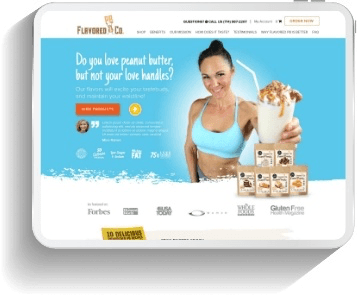
Take the original design of Hounds Town as an example. (Click on the CTA: SEE THE ‘BEFORE’ DESIGN)
Their CTA buttons were either prompting visitors to “Ask a Question”, offering to show them more information (“Learn More”), or helping them find a location (“Find Your Local Hounds Town”).
None of this told website visitors how they would personally benefit from the service, or prompted them to take an action (like booking a dog sitting session).
Instead, on the new website design: HoundsTownUSA.com we made the first CTA on their website “Book My Free Day of Daycare”. This not only takes visitors directly to the booking screen, making the customer journey smoother and faster, but it also tells visitors what precise benefit they’ll get by clicking – a free day of doggy daycare!
By switching to CTA buttons that focused on the benefits of their services, Hounds Town immediately saw a rise in conversions on their website.
For example, instead of a CTA button that reads, Find Out More, let them know what step you specifically want them to take, such as Book a Discovery Call or Join Free Today.
Using action words helps you signal what they can expect to happen next when they click on the button.
Words like Buy Now, Shop Now, Add to Cart, Subscribe Now or Join Now – you’ve probably seen these action words on dozens of websites. These action words make a big difference (after all, it is a call to action!).
When your CTA copy is well-written with action words and specificity, there is no question about what step you want your website visitors to take next.
Other examples include Download Free Guide Now, Register For Webinar Now, Start Free Trial Now, Buy Now & Save, and Book a FREE Strategy Call.
The takeaway: if you want to entice people to take action, tailor your CTAs to the needs and desires of your customer and immediately communicate your value.
The next step is to make sure the CTA button stands out…
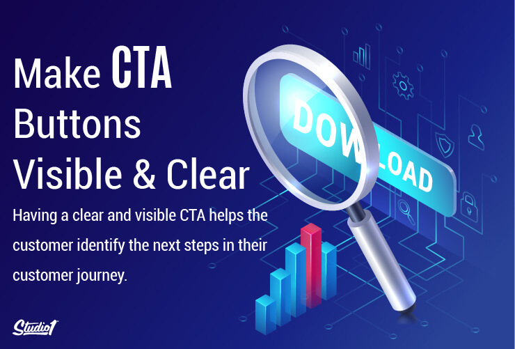
4. Make CTAs Visible and Clear
The last thing you want is a website visitor who’s ready to convert but doesn’t see the button!
There was a trend a few years ago called ‘Ghost Buttons’. A ghost button is a button that has no fill color and just has a think outline. Unfortunately, a lot of people are still using them. Please don’t use that style of button because they DO NOT CONVERT anywhere near as much as a button with a contrast color fill!
Having a clear and visible contrast CTA helps the customer identify the next steps in their customer journey immediately. When you don’t make it obvious, they’ll quickly lose interest and abandon your website (and end up on a competitor’s instead).
People are used to seeing CTA buttons, infact they expect to see what action they need to take next. Omitting a CTA can hurt your conversion rate – it can confuse or annoy your visitors because they’ll have to think about what they should do next. CTAs, on the other hand, literally point out their next course of action.
An effective CTA should be benefit-driven, visible and clear, appropriately placed, and lead customers to the next steps in their journey to conversion.
But simply having conversion-optimized CTA buttons isn’t the only thing you have to consider to boost customer conversions on your website. Having engaging conversion copy for your landing pages, every page of your website designed in a way that guides visitors towards making a purchase, and developing a memorable, consistent brand identity are equally important.
Summary:
The point of this article is to get you thinking about what matters to your prospects. You must deliver the right message to the right audience at the right time.
If you understand the principles around your audience, then you are far more likely to convert them. However the application of the principles can vary, and you won’t know what resonates the most with your audience until you start testing. So apply what you think is the right solution, then run a split set with a variant. Then see which one wins.
If you’re ready to have a conversion-optimized website that has the right strategy to get people clicking on your CTA buttons, then we’d love to help.
The Studio1 Design team has designed thousands of high-performing websites and landing pages for top marketers and brands to boost their conversions.
Check out our design case studies and the results our clients have achieved with a website designed by Studio1.
Press the button below for a website design quote or contact us if you have any questions.