There are around 1.8 billion websites in the world—yet the majority of those websites are not designed to convert.
Many websites offer valuable information however they still fail to convert visitors into warm prospects, let alone paying customers.
Your website is more than just an expense—it’s a gateway to unlocking your business’s growth potential.
When creating your business website you probably considered the following:
- The investment to design, build and maintain your website.
- The additional costs of online marketing—such as PPC (Pay Per Click) advertising, SEO (Search Engine Optimization)
- Ongoing content creation – such as blogging, videos or podcasts, etc.
However, it’s not just about the amount you spend on your website and marketing, you could be leaving money on the table if you have a poor website design.
The hidden costs of poor design
If your visitors don’t like the experience they have when they first land on your website, you’ve probably lost them for good.
- They will just leave and you will never know why they left
- Imagine if they did buy from you and they were happy with your product or service
- They could have referred others to you, then those people could have referred others, and so on…
- That’s what you could be missing out on just by having a poorly designed website
Here are some of the issues with poorly designed websites:
- They are hard to understand
- They are complicated to navigate
- They are annoyingly full of pop-ups and moving elements
- They are not addressing the needs of their visitors
- They are a “wall of words”
- They are all about your products and services (not about the value you provide)
- They are slow to load (especially on mobile devices)
Most websites don’t convert because they don’t have a strategy
Instead, they tell and try to sell, however, they’re not designed to lead a visitor through a sales funnel and create an ongoing relationship.
They’re not set up with a process in mind.
They’re lacking a process that takes a cold lead, turns it into a warm prospect, and then converts them into happy customers.
The most valuable work most businesses could do on their website doesn’t actually start on their website. It starts with designing the marketing process that they want their website to do for them.
Discover more about strategies in these articles:
- How to Convert Leads On Your Service Business Website
- How To Supercharge Your eCommerce Website Using Pre-Sell Pages
High-converting websites are marketing machines
If you want to be seen as a credible, competitive business, and you have invested in your website and marketing, you can’t afford NOT to have an effective website that drives leads and sales for your business.
What’s one business that has an effective marketing machine?
McDonald’s!
Whether you love them or not, there’s a lot you can learn from them. Success leaves clues!
The tools that McDonald’s uses to attract customers include simple strategies that you can learn from and you can apply to your website:
-
The look and feel of their branding, website, app, and restaurants all match their price-point, their offer, and their target audience (Families) – straightforward and inexpensive.
-
Social proof – If you drive past a McDonald’s there are always people there.
-
Super Authority – They are everywhere, and they advertise everywhere, so you know they are leaders in the fast food market.
-
Unique Value Proposition – They are affordable food, and fast food for the whole family
-
They lead with value – with opening offers like $1 coffee, and happy meals.
-
Scarcity principle – They only offer bonus toys occasionally which creates FOMO.
-
They are the masters of upsells – Every interaction has a follow-up offer. “Would you like fries with that”, then “Would you like a drink with that”.
- Their STRATEGY: is to play the long game! They don’t just go for today’s sale, they also want to build trust and create a relationship with you over time. They know today’s children are their future customers and are powerful at nagging their parents to get what they want!
McDonald’s uses all of the principles that we put into every website we design for our clients because this stuff works!
High-converting websites are designed to:
- Have a look and feel that is appealing to the target audience
- Be super clear with the offer and who its target audience is
- Attract interest by leading with a valuable offer
- Demonstrate that your audience is happy with your offer
- Showcase your authority and uniqueness & create liking and interest
- Segment & qualify prospects to move your visitors through your marketing funnel
- Build trust in your brand by nurturing an ongoing relationship
Once you’ve implemented the foundational work above:
- Your high-converting website will perform much better than a conventional “brochure” website.
- You’ll get a better return on your PPC ad spend and SEO investment
- You’ll feel proud to refer people to your website and market it more
So if you’re paying for a website anyway, it’s well worth putting in the effort to design your website so that it actively markets your business.
First impressions matter
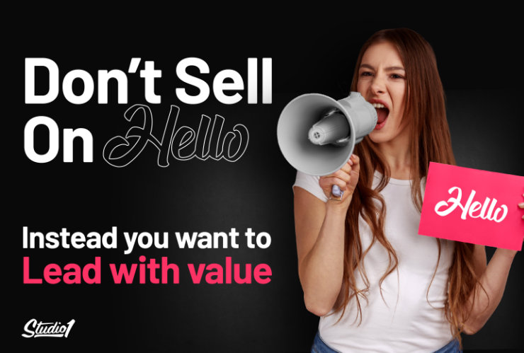
One of the most common problems we see on websites is that they expect people to buy from them when they are a first-time visitor. The golden rule is…
Instead, you want to…
LEAD WITH VALUE!
It’s absolutely astounding how few websites offer something valuable and helpful for free – particularly above the fold on their home page where it’s instantly visible to visitors.
Yet it’s so easy – just share your knowledge openly with free helpful content or offer your time for free.
In his book ‘Influence‘, Robert Cialdini calls this the Repricocity principle and has proven that when you give something of value away for free, people are far more likely to want to give back to you, whether that’s by buying from you, trusting you with their contact details with you, or by recommending you to others.
All pages on your website are part of your funnel
People could discover your website from any page on your website, so to build trust in your brand make sure every page leads people to an outcome that aligns with your website goals and helps solve their problems.
The goal is to move them to either your lead magnets or your sales pages.
On your sales pages, you want to explain how your customer BENEFIT from your offer, instead of talking about the features of your offer. They want an outcome, not features!
What will people feel and experience because they’ve bought your product or service? How will they feel when you’ve solved their problems? What improvements will they see?
Donald Miller’s ‘Building a StoryBrand’ approach is a great framework for thinking through the benefits you offer your customers. The book is a super-readable starting point and includes worksheets to help you craft the messaging to help your offer convert.
The StoryBrand framework is one piece of the puzzle however you will also need to…
Demonstrate your authority, experience, and expertise

Let people know that you really can help them by showcasing your qualification, years of business, awards, appearances, etc. This will help build trust that you can deliver on your promise.
Be clear on what makes you unique—what is it about what you do that makes YOU their best option?
Prove your results and demonstrate your credibility – collect and show product reviews and testimonials.
A picture is worth a thousand words so let’s have a look at two recent Case Studies of our clients’ recent website re-designs.
Case Study – The Women’s Meditation Network
Here’s a before and after of the Women’s Meditation Network website. The initial design wasn’t too bad, however, it wasn’t converting very well…
Some of the key conversion “gaps” were:
- It didn’t have the clarity to let people know it is essentially a podcast website
- It didn’t build trust through social proof
- It didn’t demonstrate WMN’s authority
- There was no social proof or impact metrics above the fold
- It didn’t segment people into relevant podcasts
- It didn’t have a premium offer for people to listen ad-free
- The design was average and a bit dated overall
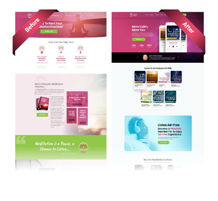
Here are the key elements we changed with the complete re-design:
- The images, the background, and high-visibility calls-to-actions
- Clarity & conversion-focused copy that tells you the benefits of what meditation does for you — more sleep, less anxiety, more happiness.
- We showcase their authority above the fold by displaying their impact metrics – 100 million downloads, 1 million monthly, and 2500+ episodes
- There is a personal testimonial above the fold.
- The ‘Listen Now’ call to action directs them to the podcast episode page – where visitors can take advantage of their value offer
- We gave them a strategy to offer a premium membership for people to listen to all podcasts ad-free.
This is a great demonstration of improving the design and conversion rate.
As you scroll down the page, you’ll see that we focused on key customer needs including:
- The free-themed podcasts – for sleep, for mornings, for panic attacks, etc.
- An ad-free premium listening option
- A library of meditation recordings you can browse
- Then an introduction to the network
- Then a free download of their 10 most popular mediations
- We finished with podcast reviews as an extra trust-builder
These changes have made a BIG difference in how visitors engage with the website and have boosted their lead and overall income. Check out the website here.
Case Study – Angela Applewhite
The website transformation that we did for author Angela Applewhite LOOKS very different from the one we did for the Women’s Mediation Network —but the underlying marketing process and design principles are similar.
Here’s the before and after of Angela’s website…
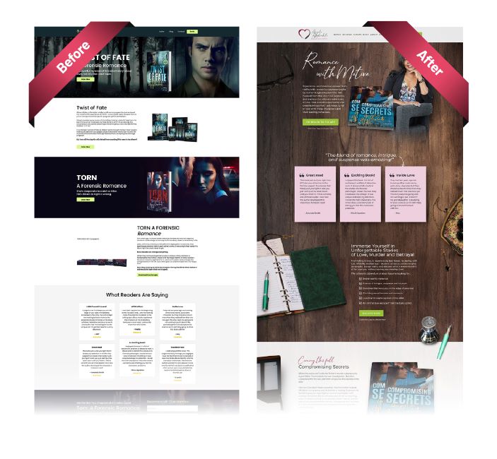
Angela writes forensic romances that combine crime thrillers with love stories. So it’s understandable that her original website was all about her books. However, that’s not how really high-converting websites work.
Angela’s website was already quite a good-looking, long-form website—but it wasn’t performing for her. It violated one of the most fundamental principles of high-converting website design: “Don’t sell on hello!”
As soon as you landed on the website, you were asked to “Order Now”, and the next two calls to action were “Order Now”. It was only when you scrolled to the end of the page that you were offered a free sample chapter and shown any of her reader reviews.
If you didn’t understand what a forensic romance was, or you didn’t like the cover art, or you weren’t immediately seeking a mystery to read, you probably wouldn’t stay.
(you could easily be forgiven for thinking she wrote about vampires or werewolves, based on the imagery and color palette).
Angela Applewhite – upgraded for conversion
Go to Applewhite.ca today and you see a very different website – one that starts with Angela, giving her website visitors some insight into who she is and what she writes.
Let’s look at the above-the-fold in terms of a marketing process. What does it do?
- It introduces Angela as a person—with a picture and a short explanation of her work.
- It creates clarity, with an explanation of the books she writes as “Romance with Motive” and “the ultimate adventure in Love”.
- It leads with value—a download of a free short story.
The next element down the page is social proof—feedback from people who have read and loved her previous work:
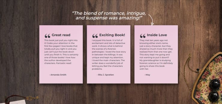
Then there’s some “why?”— some conversion-oriented copy about the benefits of Angela’s books to her readers—ESCAPE.

THEN we talk about her writing such as:
- Her next book
- Her most recently published book
- Her debut novel
Then we follow up with:
- More reviews
- More about Angela the person—writer, travel addict, wine-lover
- An introduction to her blog on her writing process, stories, and characters
- Then we offer an opportunity to join her ‘Romance with Motive’ club
When you look at the top menu, you will also see that we don’t just show social proof—we’ve also created an engagement process. There’s a new page where she can collect reviews and build a whole library of social proof from her readers.
We made a whole range of other design changes, for example, background colors and heading fonts. All the changes were designed around Angela’s audience and her funnel.
So what does a high-converting website actually look like?
A high-converting website is a website designed around an explicit, structured marketing strategy. The result is a process that’s carefully designed:
- To connect with casual visitors and keep them interested.
- To turn the right visitors into prospects.
- To warm those prospects up and increase their interest.
- To convert warm prospects into customers.
- To nurture first-time customers so they become repeat customers.
At Studio1 Design, we’ve created thousands of custom websites for businesses worldwide in hundreds of industries and niches. All our websites are custom-designed to convert more visitors into hot leads and sales.
If you’re ready for a new website design, but you want to make sure we’re a good fit first, then book a free consultation with us.
We’ll show you how we will take your website and brand to the next level, so you can have a bigger impact on your audience.
No pressure, no obligation – just a friendly conversation about what you want your website to do and whether we can help.

